


Tag: Frontend Development

  • Beginner’s Guide to CSS Custom Properties Variables

    Beginner’s Guide to CSS Custom Properties Variables

    Short answer: CSS custom properties, often called CSS variables, are entities defined by authors that contain specific values to be reused throughout a document. You declare them with a double hyphen prefix like –main-color: #333; and access them using the var() function, e.g., color: var(–main-color);. They support inheritance, scoping, and dynamic updates via JavaScript, making them more powerful than preprocessor variables.

    Key takeaways

    • CSS custom properties are natively supported in all modern browsers.
    • Use the — prefix to declare, var() to consume.
    • Scope is determined by the element cascade and inheritance.
    • They can be changed dynamically with JavaScript.
    • Great for theming without multiple stylesheet overrides.
    • Unlike preprocessor variables, they cascade and inherit.

    Have you ever found yourself repeating the same color, font size, or spacing value across dozens of CSS rules? It gets tedious fast. One small design change can force you to search and replace across multiple files. CSS custom properties, commonly called CSS variables, solve this problem elegantly. They let you store values in one place and reference them anywhere in your stylesheet. With native browser support now universal, there’s no reason not to use them.

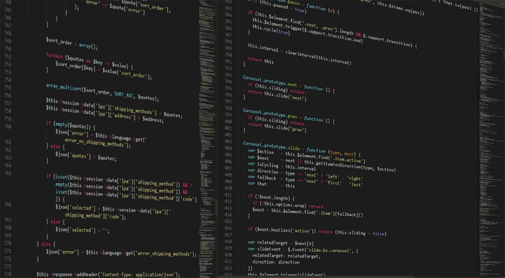
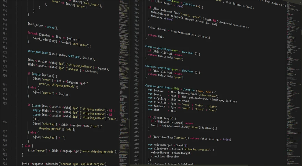
    Designer adjusting colors on a website mockup with custom properties
    Using custom properties for theming — Photo: jamesmarkosborne / Pixabay

    What Are CSS Custom Properties?

    CSS custom properties are entities defined by CSS authors that hold specific values which can be reused throughout a document. They follow the same cascade and inheritance rules as any other CSS property. You define them using a double hyphen prefix like --primary-color, and you retrieve their values using the var() function.

    For example, you might set a brand color in a :root rule and then apply it wherever needed:

    :root {
      --primary-color: #3498db;
    }
    
    .button {
      background-color: var(--primary-color);
    }
    

    Now, if you ever want to change your primary color, you update it in one place. All references update automatically. No find-and-replace. No missed instances.

    Declaring and Using CSS Custom Properties

    Declaring a custom property is straightforward. You write a property name starting with two hyphens, then a colon, then any value that would be valid for a CSS property. The value can be a color, length, number, string, or even a complex expression.

    :root {
      --main-bg: #f5f5f5;
      --gutter: 16px;
      --font-stack: 'Helvetica', Arial, sans-serif;
    }
    

    To use these variables, you wrap the property name inside var():

    body {
      background-color: var(--main-bg);
      padding: var(--gutter);
      font-family: var(--font-stack);
    }
    

    The var() function also accepts a fallback value as a second argument. If the custom property isn’t defined, the fallback gets used:

    .card {
      border: 1px solid var(--border-color, #ddd);
    }
    

    This is especially useful when working with components from third-party libraries or when you want to provide sensible defaults.

    Scope and Inheritance

    One powerful feature of CSS custom properties is that they follow the cascade. Where you declare a custom property determines its scope. A property declared on :root is available globally. If you declare it on a specific element, it only applies to that element and its descendants.

    .alert {
      --alert-bg: #ffeeba;
      background-color: var(--alert-bg);
    }
    
    .alert .close-btn {
      color: var(--alert-bg); /* inherits from .alert */
    }
    

    This scoping behavior lets you create component-specific overrides without affecting other parts of the page. For example, you might define a default button style with global variables, then override those variables inside a special section to create a variant.

    :root {
      --btn-bg: #007bff;
      --btn-color: #fff;
    }
    
    .danger-zone {
      --btn-bg: #dc3545;
      --btn-color: #fff;
    }
    

    Now, any button inside .danger-zone will automatically use the red background, while buttons elsewhere keep the blue. No extra classes, no specificity battles.

    Dynamic Updates with JavaScript

    Unlike preprocessor variables (like those in Sass or Less), CSS custom properties can be changed at runtime via JavaScript. This opens up many possibilities for interactive themes, user preferences, and animations.

    To read a custom property value from an element:

    const root = document.documentElement;
    const primaryColor = getComputedStyle(root).getPropertyValue('--primary-color').trim();
    

    To set a custom property value:

    root.style.setProperty('--primary-color', '#e74c3c');
    

    With this technique, you can build a dark mode toggle that flips a set of variables:

    1. Define your light theme colors on :root.
    2. Define alternative dark theme values under a .dark-mode class.
    3. When the user clicks a toggle, add or remove the class on the body.
    4. The cascade updates all colors automatically.

    No need to write separate stylesheets or reload the page. The same principle applies to creating interactive dashboards, live previews, or adjusting spacing based on viewport size using JavaScript.

    JavaScript code changing a CSS custom property value
    Dynamically updating CSS variables with JavaScript — Photo: Pexels / Pixabay

    CSS Variables vs. Preprocessor Variables

    If you’ve used Sass or Less, you might wonder how CSS custom properties compare. Both help you avoid repetition, but they work differently. Let’s break it down.

    Feature CSS Custom Properties Preprocessor Variables (Sass)
    Runtime access Yes, with JavaScript No, compiled away
    Inheritance Follows CSS cascade Not inherited; lexical scope
    Dynamic theming Easy via class or JS Requires recompilation
    Media queries Can be used inside Can’t be used inside without workarounds
    Browser support Modern browsers Requires a preprocessor
    Computation No built-in math Can perform arithmetic

    The key takeaway is that preprocessor variables are great for build-time consistency, while CSS custom properties shine for runtime flexibility. For most projects, using both together makes sense: preprocessor variables for static values (like breakpoints or math calculations) and custom properties for dynamic theming.

    Practical Use Cases

    Consistent Spacing and Sizing

    Define a spacing scale as custom properties:

    :root {
      --space-xs: 4px;
      --space-sm: 8px;
      --space-md: 16px;
      --space-lg: 24px;
      --space-xl: 32px;
    }
    

    Then use them throughout:

    .card {
      padding: var(--space-md);
      margin-bottom: var(--space-lg);
    }
    .card-title {
      margin-bottom: var(--space-sm);
    }
    

    This ensures every component adheres to your spacing system. Adjusting the whole design’s rhythm becomes a one-line change.

    Theming

    As mentioned earlier, custom properties are perfect for theming. You can define a set of color variables and swap them by toggling a class on a parent element:

    .dark-theme {
      --bg: #222;
      --text: #eee;
      --link: #80bfff;
    }
    

    Apply the class to the body, and all child elements that use these variables update instantly.

    Component Variants

    Instead of using modifier classes that override specific properties, you can define variant variables:

    .btn--primary {
      --btn-bg: #007bff;
      --btn-color: #fff;
    }
    .btn--secondary {
      --btn-bg: #6c757d;
      --btn-color: #fff;
    }
    .btn {
      background-color: var(--btn-bg);
      color: var(--btn-color);
      padding: 0.5rem 1rem;
      border: none;
    }
    

    This reduces specificity issues because you’re only varying the variables, not overriding multiple rules.

    Responsive Design

    You can change custom property values inside media queries:

    :root {
      --gutter: 8px;
    }
    
    @media (min-width: 768px) {
      :root {
        --gutter: 16px;
      }
    }
    

    Now any element using --gutter will have more spacing on larger screens. This is cleaner than rewriting margins and paddings for each breakpoint.

    Working with calc() and Custom Properties

    Custom properties work well with the calc() function, enabling dynamic calculations. For example, you can combine a variable with a fixed unit:

    :root {
      --base-size: 1rem;
    }
    
    .title {
      font-size: calc(var(--base-size) * 2);
    }
    

    You can also use multiple variables together:

    :root {
      --column-count: 3;
      --gap: 1rem;
    }
    
    .grid {
      display: grid;
      grid-template-columns: repeat(var(--column-count), 1fr);
      gap: var(--gap);
    }
    

    This pattern makes it easy to adjust layouts by changing just the variable values. Note that you cannot use custom properties inside calc() without the var() wrapper, and the expression must be valid at runtime.

    Debugging Custom Properties

    When something goes wrong with custom properties, the browser’s developer tools are your best friend. In the Elements panel, you can inspect any element and see the computed value of --custom-property. If the value is blank or shows an error, you might have a typo or a scope issue. Another trick is to temporarily add a fallback to see if the property resolves correctly. For instance, changing var(--my-var) to var(--my-var, red) will paint the element red if the variable is missing, confirming the issue. Common problems include using the wrong case or referencing a variable that was never declared. Always double-check that you are using the exact same name, including hyphens and case.

    Common Pitfalls and Tips

    • Case sensitivity: --primary and --Primary are different. Stick to a consistent naming convention, like kebab-case.
    • Missing fallback leads to invalid values: If you use a custom property that isn’t defined and provide no fallback, the property becomes invalid and gets ignored. Always provide a fallback when there’s a chance the variable might not be set.
    • Cannot be used in media queries directly: Custom properties don’t work inside @media query conditions because they are resolved at runtime, not parse time. Use media query ranges or preprocessor variables for breakpoint values.
    • Inheritance surprises: Because custom properties inherit, a child element might pick up a parent’s variable unintentionally. Override it explicitly if needed.
    • Performance considerations: Browser engines handle custom properties efficiently. However, excessive use of var() inside animations or on many elements can cause slight layout recalculations. Measure if you notice jank.

    CSS custom properties are a mature, practical feature that can simplify your stylesheets and make them far more maintainable. Start small: extract your colors, fonts, and spacing into variables. Once you get the hang of it, explore dynamic theming and component variants. Your future self will thank you.

    Frequently asked questions

    What is the difference between CSS custom properties and variables in Sass?

    CSS custom properties are native to the browser and can be changed at runtime using JavaScript. They follow the cascade and inheritance. Sass variables are compiled away and cannot be accessed or changed after the stylesheet is built. Use CSS custom properties for dynamic values and Sass variables for static build-time values.

    How do I set a fallback value for a CSS custom property?

    Pass a second argument to the var() function: var(–custom-prop, fallback-value). If –custom-prop is not defined, the fallback-value is used. Ensure the fallback is syntactically valid for the property, or the entire declaration becomes invalid.

    Can CSS custom properties be used inside media queries?

    You cannot use a custom property as the condition in a @media query, because custom properties are resolved dynamically. However, you can change the value of a custom property inside a media query and then use that variable elsewhere in your styles.

    Do CSS custom properties have performance issues?

    Modern browsers handle custom properties very efficiently. In most cases, the performance impact is negligible. However, if you use var() in many properties that trigger layout or painting, and change those variables frequently (e.g., via JavaScript animations), it may cause extra work. Usually, the benefits outweigh the costs.

    How do I inspect CSS custom properties in browser DevTools?

    In Chrome DevTools, open the Styles panel and scroll to the bottom where custom properties are listed. You can also see them in the Computed panel. Firefox has a dedicated Variables view in the Inspector. Click on the var() function to see its definition or set new values.

  • 10 Common Accessibility Mistakes Frontend Developers Make

    10 Common Accessibility Mistakes Frontend Developers Make

    Short answer: Common accessibility mistakes include insufficient color contrast, missing form labels, non-semantic HTML, poor keyboard navigation, images without alt text, and improper use of ARIA. These errors harm users with disabilities and can be fixed with testing and awareness.

    Key takeaways

    • Always use semantic HTML elements over divs for structure.
    • Provide clear labels and instructions for all form fields.
    • Ensure color contrast meets WCAG AA standards (4.5:1).
    • Test your app with keyboard-only navigation.
    • Add descriptive alt text to all meaningful images.
    • Use ARIA sparingly and only when native HTML is insufficient.

    Accessibility is often an afterthought in frontend development, but it shouldn’t be. Many developers unknowingly introduce barriers for users with disabilities. The good news? Most common accessibility mistakes are easy to fix once you know what to look for. This article covers the top 10 mistakes and how to avoid them.

    Person checking color contrast on a laptop screen
    Testing color contrast with a tool. — Photo: shogun / Pixabay

    1. Insufficient Color Contrast

    Color contrast is one of the most frequent accessibility issues. Text with low contrast against its background is hard to read, especially for users with low vision or color blindness. The Web Content Accessibility Guidelines (WCAG) require a contrast ratio of at least 4.5:1 for normal text and 3:1 for large text.

    To fix this, use a contrast checking tool during design. Avoid light gray text on white backgrounds. Stick to dark text on light backgrounds or vice versa. If you use brand colors, verify they meet the ratio. Tools like the WebAIM Contrast Checker can help you test combinations.

    A common mistake is relying on color alone to convey information, like indicating required fields with only red text. Always supplement color with icons, patterns, or text labels. When designing, consider users with color blindness by checking your palette in a simulator. Also, ensure that hover and focus states maintain sufficient contrast — a subtle change may not be noticeable enough.

    2. Missing Form Labels

    Forms without proper labels are a nightmare for screen reader users. Never rely solely on placeholder text as a label. Placeholders disappear when users start typing, and they often have insufficient contrast.

    Every input should have an explicit <label> element with a for attribute matching the input’s id. Alternatively, you can use aria-label or aria-labelledby. Group related checkboxes and radio buttons with a <fieldset> and <legend>. For example:

    <label for="email">Email Address</label>
    <input type="email" id="email" name="email">

    If you cannot use a visible label for design reasons, still provide an accessible label with aria-label. But remember, visible labels help all users, not just those using screen readers. Also, ensure that error messages are associated with inputs using aria-describedby, so screen readers announce them.

    3. Non-Semantic HTML

    Using <div> and <span> for everything is common but harmful. These elements provide no semantic meaning to assistive technologies. Instead, use native HTML elements that carry built-in roles and behaviors.

    • Use <nav> for navigation
    • Use <main> for primary content
    • Use <button> for clickable actions
    • Use <heading> elements (h1-h6) for headings

    Semantic HTML is the foundation of accessible web development. It reduces the need for ARIA and makes your code more maintainable. For more on optimizing your frontend, check out React vs Next.js: Choosing the Right Framework for Your Project.

    A common misstep is using a <div> with an onclick for a button. While you can add ARIA roles and keyboard listeners, a native <button> is easier and more reliable. Similarly, using <h1> for branding instead of the page title misleads screen reader users. Ensure your heading hierarchy is logical and each page has exactly one <h1> that describes the page content.

    4. Poor Keyboard Navigation

    Not all users can use a mouse. Some rely on keyboard navigation. Common mistakes include missing focus indicators, incorrect tab order, and interactive elements that are not keyboard accessible.

    Always provide a visible focus outline (never use outline: none without a replacement). Ensure the tab order follows the visual order of the page. All interactive elements like links, buttons, and form controls should be reachable and operable via keyboard. Test your site by tabbing through every element.

    Also, avoid setting tabindex greater than 0, as it disrupts the natural focus order. Instead, organize your DOM flow to match visual order. For custom components like dropdowns or modals, trap focus within the modal when open and return focus to the trigger element on close. Use JavaScript to manage focus, but test thoroughly.

    5. Images Without Alt Text

    If an image has no alt text, screen readers may read the file name, which is useless. Informative images need descriptive alt text. Decorative images should have alt="" (empty alt) to be ignored by assistive technology.

    Write alt text that conveys the purpose of the image. For example, “A dog playing fetch in a park” is good for a photo of a dog. Don’t say “Image of a dog” — that’s redundant. Avoid keyword stuffing. If the image is a link, describe the destination. For complex images like charts, provide a text alternative nearby.

    A common mistake is writing overly long alt text. Keep it concise but informative. For SVG icons used as buttons, give them role="img" and aria-label. For background images in CSS, ensure the content is decorative, or include equivalent text in the HTML.

    6. Improper Use of ARIA

    ARIA (Accessible Rich Internet Applications) can enhance accessibility, but misuse can make things worse. A common mistake is adding role="button" to a <div> without adding keyboard support. Another is overusing ARIA attributes where native HTML would suffice.

    Follow the first rule of ARIA: don’t use ARIA if you can use a native HTML element. When you do use ARIA, test with a screen reader. Use roles, states, and properties correctly. For example, aria-expanded should reflect the actual state of a toggle.

    Another pitfall is using tabindex="-1" on non-interactive elements just to make them focusable via script. This can confuse users if not managed carefully. Only make elements focusable if they are interactive. Similarly, avoid using aria-hidden="true" on focusable elements, as it hides them from screen readers but not from keyboard focus.

    7. Not Providing Sufficient Focus Indicators

    Some developers remove focus outlines for aesthetic reasons, leaving keyboard users lost. A strong, visible focus indicator is essential. You can style it with :focus-visible to show it only when needed (e.g., keyboard navigation).

    Aim for a 2px solid outline with a color that contrasts well with the background. Do not rely solely on changes in background color, as that may not be noticeable.

    For custom components like tabs or menus, ensure focus indicators are visible on all states. If you use a box-shadow for focus, ensure it has sufficient contrast and is not clipped. Test your focus styles in high contrast mode on Windows, as some themes override outlines.

    Web form with text input and visible label
    Every form input needs a clear label. — Photo: ptdh / Pixabay

    8. Inaccessible Dynamic Content

    Single-page applications often update content without page reloads, which can confuse screen readers. When content changes dynamically (e.g., loading more items, updating a cart), you need to inform assistive technologies.

    Use aria-live regions to announce changes. Choose the right politeness setting: aria-live="polite" for non-critical updates, aria-live="assertive" for urgent ones. For example, when a user adds an item to a cart, announce “Item added to cart” via a live region. Also, move focus to newly added content when appropriate.

    A common mistake is using aria-live on the entire container that gets updated, which may read too much content. Instead, target a small region or use a dedicated live region for announcements. For infinite scroll, provide an accessible way to load more content, like a “Load more” button, and announce the number of new items.

    9. Missing Captions and Transcripts for Media

    Videos need captions for deaf and hard-of-hearing users. Audio content needs transcripts. This is not just a good practice — it’s required by WCAG at level A.

    Provide synchronized captions for videos. For audio podcasts, include a text transcript. Transcripts also benefit SEO and users who prefer reading. Tools like automatic captioning can generate a starting point, but always review for accuracy.

    For live media, strive for real-time captions. If that is not feasible, provide a summary or alternative. Also, ensure that video players themselves are accessible — controls should be keyboard operable and labeled with ARIA.

    10. Not Testing with Real Users or Tools

    Many developers rely only on automated checkers, but automation catches only about 30% of accessibility issues. Manual testing and real user feedback are essential.

    Use a combination of tools like axe, Lighthouse, and WAVE for automated checks. Then do manual keyboard testing and test with a screen reader (VoiceOver on Mac, NVDA on Windows). Involve users with disabilities in usability testing if possible. For more on improving site performance alongside accessibility, see Lazy Loading for Better Web Performance.

    11. Misusing Heading Hierarchy

    Headings are the backbone of page navigation for screen reader users. A common mistake is skipping heading levels, like jumping from an h2 to an h4, or using headings purely for visual styling. This breaks the logical structure and confuses users.

    Always maintain a logical heading hierarchy: h1 for the page title, h2 for main sections, h3 for subsections, and so on. Never skip levels — if you need a smaller visual size, use CSS instead of a lower heading level. Use browser extensions like the HeadingsMap tool to verify your structure.

    12. Ignoring Motion and Time-Based Interactions

    Animations, auto-playing videos, and time limits can be problematic for users with vestibular disorders, ADHD, or cognitive disabilities. A common mistake is not providing controls to pause, stop, or hide moving content.

    Offer a way to reduce motion for users who prefer it, using the prefers-reduced-motion media query. For auto-playing videos, include a pause button prominently. For time limits, allow users to extend or disable them. If you use scrolling text or carousels, provide play/pause controls and avoid infinite auto-scroll.

    How to Get Started with Fixing Accessibility

    Start by auditing your existing site. Run an automated scan, fix critical issues like contrast and form labels, then test manually. Accessibility is an ongoing process, not a one-time fix.

    Educate your team on a11y best practices. Add accessibility checks to your CI pipeline. Make it part of your definition of done. Small changes add up to a much better experience for everyone.

    For more on performance and accessibility, read How to Improve Web Performance with Lazy Loading.

    Frequently asked questions

    What is the most common accessibility mistake?

    Insufficient color contrast is one of the most common mistakes. Low-contrast text is hard to read for many users. Always ensure text meets WCAG AA contrast ratios of at least 4.5:1 for normal text and 3:1 for large text.

    How can I test my site for accessibility?

    Use automated tools like axe or Lighthouse for initial checks. Then manually test with keyboard navigation and a screen reader (e.g., VoiceOver on Mac, NVDA on Windows). Involve users with disabilities for the most thorough evaluation.

    Do I need to add ARIA to every element?

    No. Use native HTML elements first, as they have built-in semantics. ARIA should only augment HTML when native elements cannot provide the needed accessibility. Overusing ARIA can actually harm accessibility.

    What should I put in alt text?

    Alt text should describe the purpose or content of the image. For informative images, be concise but descriptive. For decorative images, use empty alt (alt=””). Avoid phrases like ‘image of’ and never stuff keywords.

    Can accessibility improvements also help SEO?

    Yes, many accessibility practices like semantic HTML, descriptive alt text, and good color contrast also benefit SEO. Search engines favor well-structured, readable content. Accessibility and SEO often go hand in hand.

  • Common CSS Grid Mistakes and How to Fix Them

    Common CSS Grid Mistakes and How to Fix Them

    Short answer: Common CSS Grid mistakes include not specifying explicit tracks, misplacing alignment properties on the container vs items, forgetting gap handling, and creating fragile layouts with hardcoded line numbers. Fix these by defining grid-template-columns explicitly, using place-items for simple centering, adding gaps consistently, and naming grid lines for robust responsive designs.

    Key takeaways

    • Always define explicit grid-template-columns for predictable layouts.
    • Use place-items on the container for quick centering.
    • Use gap instead of margins to avoid spacing issues.
    • Name grid lines for easier responsive overrides.
    • Test overlap behavior with z-index and proper placement.

    CSS Grid is one of the most powerful layout tools in modern frontend development. But with great power comes the potential for subtle mistakes that can break your design or make your code harder to maintain. In this article, I’ll walk through the most frequent CSS Grid mistakes I’ve seen in production and show you how to fix them.

    1. Not Defining Explicit Grid Tracks

    One of the first mistakes beginners make is using CSS Grid without defining explicit grid tracks. They create a grid container but rely entirely on the browser’s implicit grid behavior. This often leads to unpredictable layouts.

    For example, if you set display: grid on a container without grid-template-columns, the browser creates a single-column grid by default. Items stack vertically, which may not be what you intended.

    How to fix it

    Always define at least grid-template-columns to explicitly state how many columns you want and their sizes. Use units like 1fr, auto, or fixed lengths. For example:

    .container {
      display: grid;
      grid-template-columns: 1fr 1fr 1fr; /* three equal columns */
      gap: 1rem;
    }
    

    This gives you a predictable three-column grid. Without it, you’re leaving layout decisions to the browser.

    Person sketching a grid layout in a notebook
    Sketching CSS Grid layouts — Photo: congerdesign / Pixabay

    2. Forgetting to Define Grid Items as Grid Children

    Another common mistake is assuming that any element inside a grid container automatically becomes a grid item. While that’s true for direct children, nested elements are not grid items. If you apply grid properties to nested elements, they won’t work as expected.

    Consider this HTML:

    <div class="grid">
      <div class="item">
        <p>I am not a grid item</p>
      </div>
    </div>
    

    The <p> tag is not a direct child of .grid, so it won’t be placed by the grid. This often confuses developers who try to use grid-column on the <p> directly.

    How to fix it

    Ensure that only direct children of the grid container are styled with grid placement properties. If you need to lay out deeper elements, consider nesting another grid or using flexbox inside those items.

    3. Misusing Alignment Properties

    CSS Grid offers two sets of alignment properties: one for the container (justify-items, align-items, place-items) and one for individual items (justify-self, align-self, place-self). Swapping these up can lead to alignment not taking effect.

    A typical example is trying to center a grid item by setting justify-content: center on the container. That property aligns the grid tracks (the whole column structure), not the items inside them. To center items within their cells, use justify-items: center or place-items: center.

    Responsive grid layout shown on a tablet and phone
    Responsive CSS Grid examples — Photo: ElisaRiva / Pixabay

    Comparison table: Alignment properties

    PropertyApplies toEffect
    justify-contentContainerAligns grid columns within the container
    align-contentContainerAligns grid rows within the container
    justify-itemsContainerAligns items horizontally inside their cells
    align-itemsContainerAligns items vertically inside their cells
    place-itemsContainerShorthand for align-items and justify-items
    justify-selfItemOverrides horizontal alignment for a single item
    align-selfItemOverrides vertical alignment for a single item

    4. Ignoring the Gap Property

    Many developers still use margins on grid items to create spacing. This can cause layout shifts and misalignment because margins collapse or push items beyond the grid cell boundaries. The gap property (formerly grid-gap) is designed for this exact purpose.

    Using margins also complicates responsive designs. If you change the grid structure from three columns to two on a smaller screen, you’d need to adjust margins too. With gap, it’s a single line change.

    How to fix it

    Use gap (or row-gap and column-gap) on the grid container instead of margins on child items. For example:

    .container {
      display: grid;
      grid-template-columns: repeat(3, 1fr);
      gap: 1.5rem;
    }
    

    This creates consistent spacing between all grid items without extra margins.

    5. Using Hardcoded Line Numbers for Grid Placement

    Relying on grid line numbers (like grid-column: 1 / 3) can make your layout fragile. If you later add a new column or change the grid structure, you’ll need to update every hardcoded number. This is a maintenance nightmare.

    It also makes responsive design harder because line numbers change when the number of columns changes.

    How to fix it

    Name your grid lines using the [name] syntax in grid-template-columns and grid-template-rows. Then use those names in your placement rules. For example:

    .container {
      display: grid;
      grid-template-columns: [start] 1fr [middle] 1fr [end];
    }
    .item {
      grid-column: start / end; /* spans from start to end */
    }
    

    Now if you add more columns, you only change the template, not every item’s placement.

    6. Overusing the Implicit Grid

    The implicit grid is created automatically when you place items outside the defined explicit grid. For example, if you define only two rows but place an item on row 3, that row becomes part of the implicit grid. Relying too much on implicit rows can lead to unpredictable sizes and styling, especially if you forget to set grid-auto-rows.

    Without explicit sizing, implicit rows default to auto, which can cause varying heights.

    How to fix it

    Always set grid-auto-rows or grid-auto-columns to control the size of any implicit tracks. For example:

    .container {
      display: grid;
      grid-template-columns: repeat(3, 1fr);
      grid-auto-rows: minmax(100px, auto);
    }
    

    This ensures any extra rows have a consistent minimum height.

    7. Neglecting Browser Fallbacks for Older Grid Syntax

    CSS Grid has evolved over the years. Some older browsers still use the original -ms- prefixed implementation. If you only write modern CSS Grid syntax, your layout may be broken in IE11 or older Edge versions. This is less of an issue today, but for projects requiring wider support, you need fallbacks.

    A common mistake is assuming grid-template-columns works everywhere. In IE11, you need to use -ms-grid-columns.

    How to fix it

    Use a feature query (@supports) to detect grid support, or provide a Flexbox fallback. For IE11, you can use Autoprefixer in your build process to automatically add the necessary prefixes. Example with feature query:

    .container {
      display: flex;
      flex-wrap: wrap;
    }
    @supports (display: grid) {
      .container {
        display: grid;
        grid-template-columns: repeat(3, 1fr);
        gap: 1rem;
      }
    }
    

    This way, browsers that support grid get the modern layout, and others fall back to a flexible alignment.

    8. Forgetting to Define a Grid on Responsive Overrides

    When changing the number of columns in a media query, you must redefine the grid template. Simply changing grid-template-columns without also resetting grid-auto-flow or item placements can lead to overlapping or unexpected gaps.

    For example, if you have a three-column grid and change it to two columns on mobile, any items placed on the third column will be pushed down, potentially overlapping others.

    How to fix it

    In your media queries, redefine the entire grid template and reset any explicit placements for items that might cause overlap. Use auto-flow or grid-auto-flow: dense to fill gaps intelligently. Example:

    @media (max-width: 768px) {
      .container {
        grid-template-columns: 1fr 1fr;
        grid-auto-flow: row dense;
      }
      .item {
        grid-column: auto; /* reset explicit placements */
      }
    }
    

    This approach prevents items from sticking to old column positions and maintains a logical order.

    9. Setting Grid Properties on Non-Grid Containers

    It’s easy to forget that properties like grid-gap, grid-template-areas, and grid-auto-flow only work on elements with display: grid. If you set them on a flex container or a block element, they are ignored. This can lead to wasted debugging time when spacing or alignment doesn’t apply.

    Another variant is applying grid-column to a child of a flex container. The property won’t do anything because the parent isn’t a grid.

    How to fix it

    Always verify that the parent element has display: grid set when you intend to use grid-specific properties. If you need both flex and grid behavior, consider using a grid container and aligning its items with flex properties inside each cell. Double-check your CSS for accidental overrides or missing display declarations.

    10. Not Using Grid Template Areas for Complex Layouts

    When building multi-section layouts like a page with header, sidebar, main content, and footer, many developers reach for nested containers or complex line numbering. This often results in tangled code that’s hard to modify later. Grid template areas offer a cleaner, more visual way to define such layouts.

    Without template areas, a three-row layout might require explicit grid-row values on every item, making it tedious to rearrange sections.

    How to fix it

    Use grid-template-areas to name parts of your layout, then assign each element to an area with grid-area. For example:

    .page {
      display: grid;
      grid-template-columns: 1fr 3fr;
      grid-template-rows: auto 1fr auto;
      grid-template-areas:
        "header header"
        "sidebar main"
        "footer footer";
    }
    .header { grid-area: header; }
    .sidebar { grid-area: sidebar; }
    .main { grid-area: main; }
    .footer { grid-area: footer; }
    

    This approach makes the layout readable at a glance. Rearranging items for different breakpoints becomes as simple as redefining grid-template-areas in a media query.

    Frequently asked questions

    What is the most common CSS Grid mistake?

    The most common mistake is not defining explicit grid tracks. Many developers forget to set grid-template-columns or grid-template-rows, causing the browser to create a single-column grid by default, which often leads to unexpected stacking. Always define your grid structure explicitly.

    How do I center items inside a CSS Grid?

    To center items within their grid cells, use place-items: center on the container. This is shorthand for align-items: center and justify-items: center. For individual items, you can use place-self: center on the item itself.

    Should I use margins or gap for spacing in CSS Grid?

    You should use the gap property (or grid-gap in older syntax) instead of margins on grid items. Margins can cause layout shifts and are harder to maintain, especially in responsive designs. Gap is specifically designed for grid and flexbox spacing.

    How do I make a responsive grid without media queries?

    You can use the auto-fill or auto-fit keywords with minmax in grid-template-columns. For example: grid-template-columns: repeat(auto-fill, minmax(250px, 1fr)). This automatically creates as many columns as fit the container width, with a minimum size of 250px.

    Can I use CSS Grid with IE11?

    Yes, but you need to use the -ms- prefixed properties and a polyfill or Autoprefixer. IE11 supports an older version of the grid specification. Use @supports to provide a fallback layout for modern browsers, or rely on build tools to handle prefixes.